
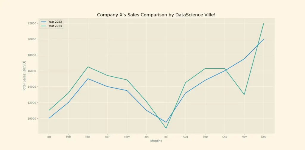
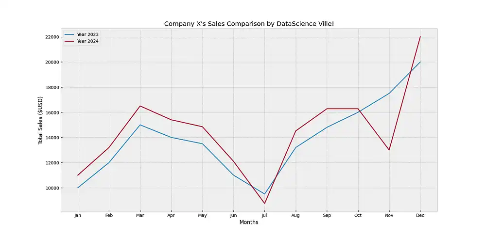
So, in a previous post, we looked at a step-by-step guide to creating a basic Matplotlib plot on Python that looked like this:
But of course, not everyone would like the appearance of this chart.
That’s why, in this post, we’ll see more options you can use to customize the appearance of your plot.
So, without beating around the bush, let’s get started:
How to Customize the Appearance of Your Matplotlib Plot
1. Using Matplotlib Stylesheets
The simplest way to customize your plot’s appearance is by using preset styles.
Fortunately, Matplotlib offers several of these stylesheets for use. Among them, we have:
- Solarize_Light2 (used for the above plot)
- fivethirtyeight
- _mpl-gallery
- bmh
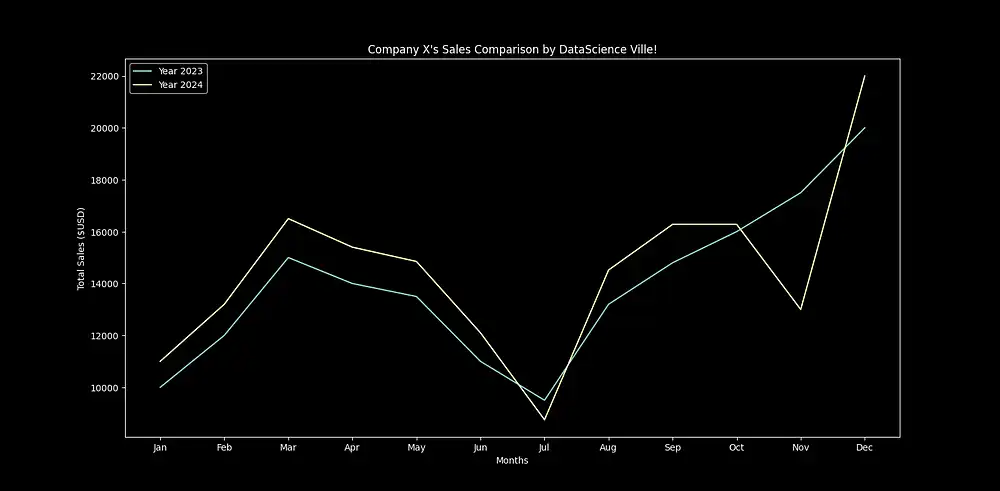
- dark_background
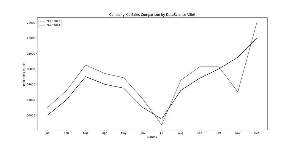
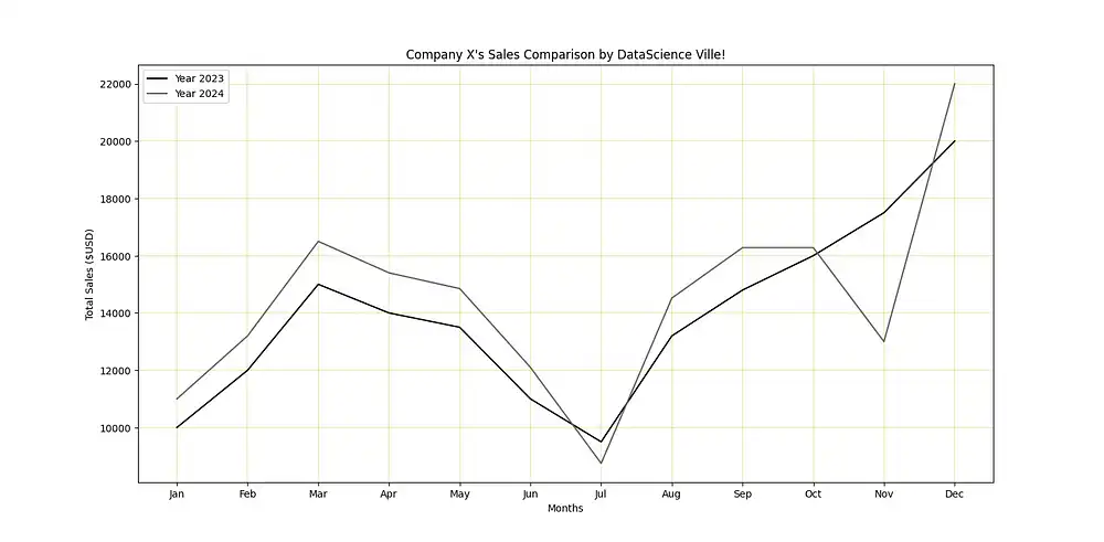
- grayscale
These stylesheets breathe life into your plot in comparison with the default and bland style:
So, how do you actually use them?
Well, it’s simple. You only need to import “styles” from Matplotlib and call them using “style.use(Preferred_Stylesheet_name)” as seen below:
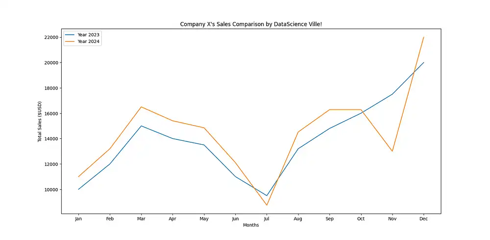
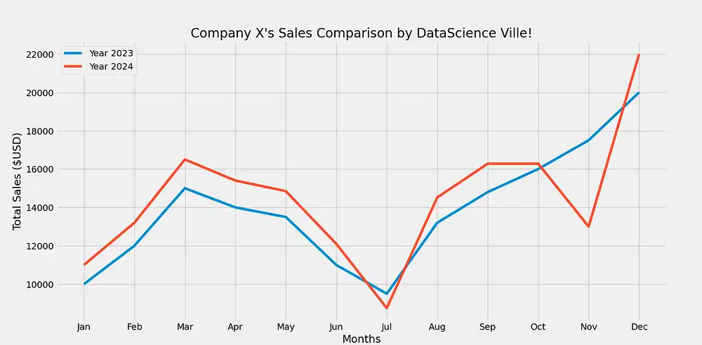
Let’s see how the other five stylesheets listed above look, right?
That’s the idea of using stylesheets for your plot. Of course, there are other presets available. You can access all of them by running “print(style.available)” in your script.
But what if you want to have manual control over the look of your plot? For example, you like the dark background preset but the line colors aren’t getting the job done for you.
Or perhaps, you like the grayscale preset but you want to make the grid visible.
No worries, you can do all this by passing your intent as arguments.
2. Using arguments
So, what are arguments?
In Python, these are simply pieces of info (values) you give to a function telling it what to do and how to behave. To customize your plot, you can pass these arguments into Pyplot’s functions. For example, let’s take the two scenarios hinted above:
Editing the “grayscale ” Preset:
To make the grid visible in this preset, you’ll be using the “grid()” function of pyplot and pass the following arguments within the parentheses:
“True ” = Indicates you want the grid to be displayed
“Color ” = Exactly what it sounds like
“Linewidth ” = The width of the grid lines
Your code should then look like this:
…and Voila:
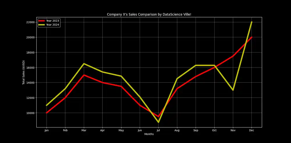
Editing the “dark_background ” Preset:
Now, for this preset, let’s say we want to display our grid, change the plot line colors, and increase the width of our plot lines.
For changing the plot line colors and increasing their widths, you’ll be passing arguments into the “.plot” function of your code like this:
Here, X and Y specify the values of your plot.
“r ”specifies the color red.
“Linewidth” edits the width of your plot lines.
Together with the “plt.grid” function, you can achieve this look with the dark_background preset:
Wrapping Up
Making your datasets more readable is the whole point of data visualization. And the appearance of your charts matters a lot in this area. So, experiment with the different styles or manually customize one till you find the style that works best for your project(s).
WANT TO KNOW HOW I MADE ALL THESE CHARTS?

Check out my guide on how to plot a basic line chart with Matplotlib
Also, stick around for more updates. Thanks for reading and Till next time!