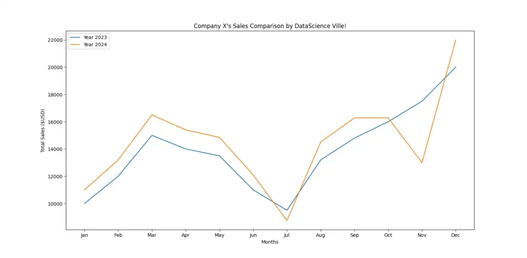
Matplotlib is one of the most popular data visualization libraries in Python. As such, there are lots of things you can do with this module. But in this post, we’ll see a basic use case of Matplotlib. That is, to create a Line Chart in Python that looks like this (or similar depending on your alterations):
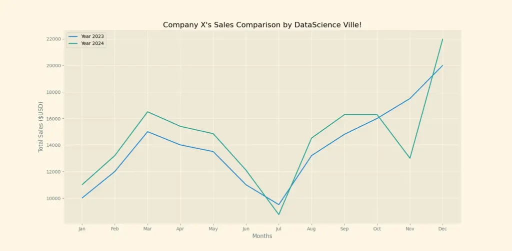
DESCRIPTION: The above illustration compares Company X’s monthly sales ($USD) in 2023 and 2024.
Does it look advanced? Well, someone I know said so. But it’s a basic representation done in only 14 lines of code.
How?
Let’s get started.
Ah, wait. Before that, you’ll need to install Matplotlib if you haven’t done so already. You can check out this post to learn how to do that.
7 Steps on How to Create a Line Chart in Python via Matplotlib!
STEP ONE: “Import Pyplot into your current script”
Pyplot is a module within Matplotlib that allows users to plot charts like the one seen above. Every function within pyplot allows users to edit their charts in one way or another.
So, you don’t need to import the entire Matplotlib library into your script.
All you need to do is import Pyplot. However, it’s kinda stressful to have to type “pyplot” every time in your code, right?
That’s why many programmers abbreviate it to “plt” using the “as” keyword:
STEP TWO: “Assign the values of the X and Y axes”
Every line chart has an X and Y axis. Duh!
So the next step is letting Python know the values of these axes.
To do that, simply assign the values of your X axis to the variable “x” and do the same for your Y axis.
Note that your values can include numbers or even strings, especially if your data includes text as seen in the chart above.
For that, here are the values I used:
Now that I’m writing, they look really detailed. Don’t worry, Company X doesn’t exist. You can just use ChatGPT to generate random numbers to experiment with 😊.
What’s next?
STEP THREE: “Plot your Graph”
Using the “.plot() function,” you can go ahead and plot your graph with Python as seen below:
While the “plot” function actually plots the graph, your code won’t display anything unless you use the “show()” function.
After that, all you need to do is run your code and it should look like this (depending also on your values):
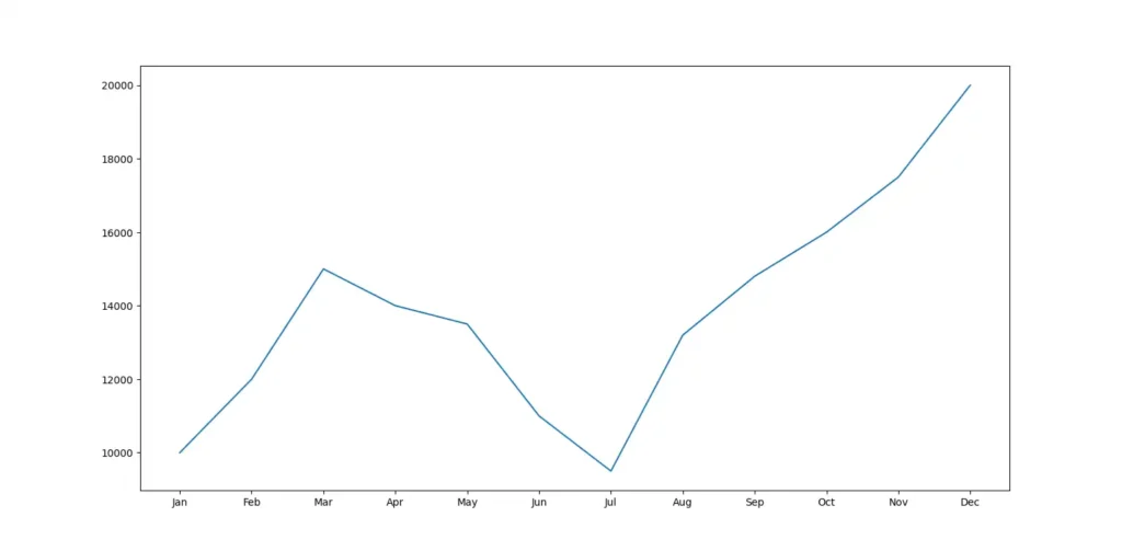
I know, I know, it’s bland and looks nothing close to what was promised above.
Before proceeding, let’s identify what’s missing, shall we?
- The chart’s title
- Labels of the X and Y axis
- The second line which represents the year 2024
- The line labels
- Colors and Styles (the life of the chart).
Now, let’s address each of them in the following steps:
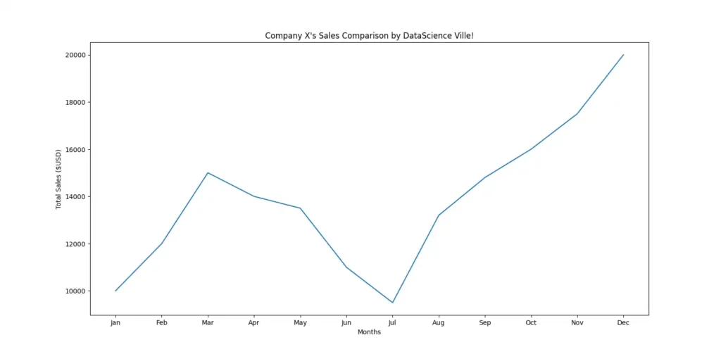
STEP FOUR: “Add your Chart’s title and Labels”
To add your chart’s title and axes labels, you’ll need to use the following three functions:
“.title()” = allows you to name your chart
“.ylabel()” = allows you to label the Y axis
“.xlabel()” = allows you to label the X axis.
Of course, when writing these functions, the “plt” or however you defined pyplot comes before the function name and the name of your chart or label is written as a string (or within quotes) inside the parentheses.
Here’s my example:
When you run this code, your returning graph will look like this:
STEP FIVE: “Add a second line”
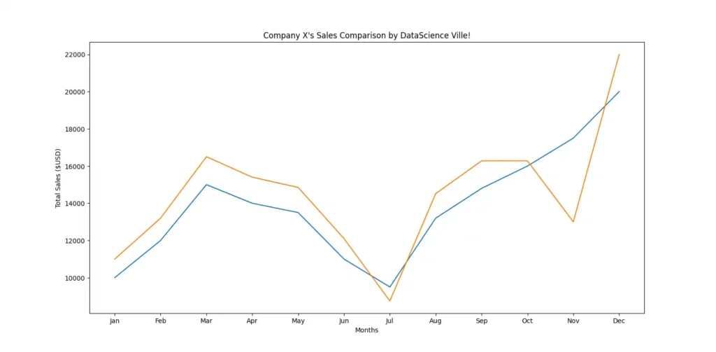
If you only have one dataset, you’re good to go from here. However, if you need to plot a second line in your chart, as seen above, you only need to repeat steps two and three (i.e. assigning the values of your axes and using the “.plot” function).
To distinguish them, you can easily refer to the new values as “x2 and y2” and plot them.
When you add this to the previous lines of code (of course, the “.show” function remains at the bottom) and run it, the result looks like this:
STEP SIX: “ Label your datasets or lines”
To do this, we’ll add label = ‘LineName’ to the “plt.plot()” function of our code.
Therefore, the new edit will look this way:
But that’s not all.
If you run it this way, you’ll see no changes to your chart. That’s why we’ll make use of another pyplot function namely “.legend()”
In other words, you’re adding this to your script:
Now, the chart will change to include the labels of the line (you can see it at the top-left):
STEP SEVEN: “Add styles”
Within Matplotlib, there’s a function that’s called “style”
It’s exactly as it sounds — it allows users to change the default style of their graph to something different. All you need to do is import it like you did pyplot.
For the above example, I used the Solarize_Light2 style:
Add these two lines to the top of your code and run it to get the following result:

Now, there’s the advanced look.
Summary
Plotting a line chart in Python, as we’ve seen, is not a very difficult task. And yes, like I said earlier, we did this in only 14 lines of code:
However, to get a clearer understanding of the steps, here’s a detailed view of the pyplot functions used in this post:
| PYPLOT FUNCTION | USE |
|---|---|
| .plot() | It allows you to create various types of plots, including Line Charts |
| .title() | It allows you to set a title for your chart |
| .ylabel() | It allows you to set a label for the Y-axis |
| .xlabel() | It allows you to set a label for the X-axis |
| .legend() | It allows you to add a legend to the plot, which helps identify different elements or datasets on the plot |
| .show() | It allows you to display the plot that you’ve created. It should be called at the end of your script after you’ve finished customizing the plot using other functions. |
But have you wondered: “Are there more styles available for your line chart?” I mean, not everyone will find the Solarize_Light2 attractive. Stick around as the next post will discuss more on the styles for your chart using Matplotlib.


